The Old City of Jerusalem
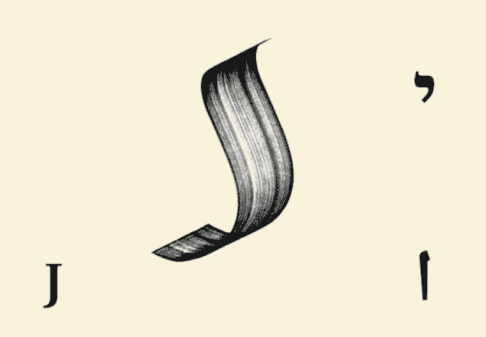
In a foolishly utopian vision, the old city of Jerusalem is not divided; it exists equally for all of its inhabitants. To visualize this, I created a single calligraphic mark, which can be read as the initial of the city in English, Arabic, and Hebrew, depending on its orientation. In the same spirit, the booklet for the UNESCO site is trilingual and reads both left-to-right and right-to-left, based on the appropriate language.
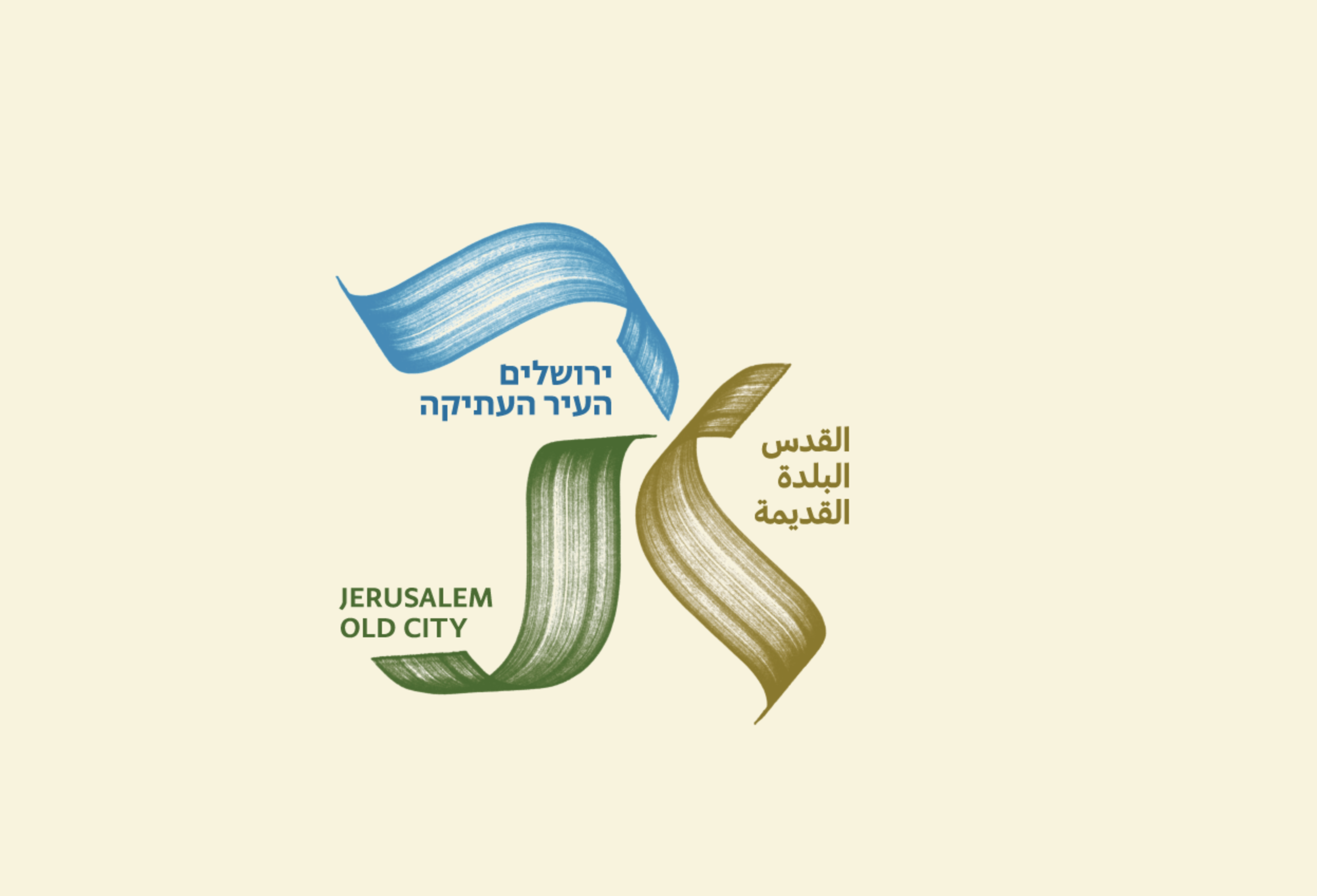

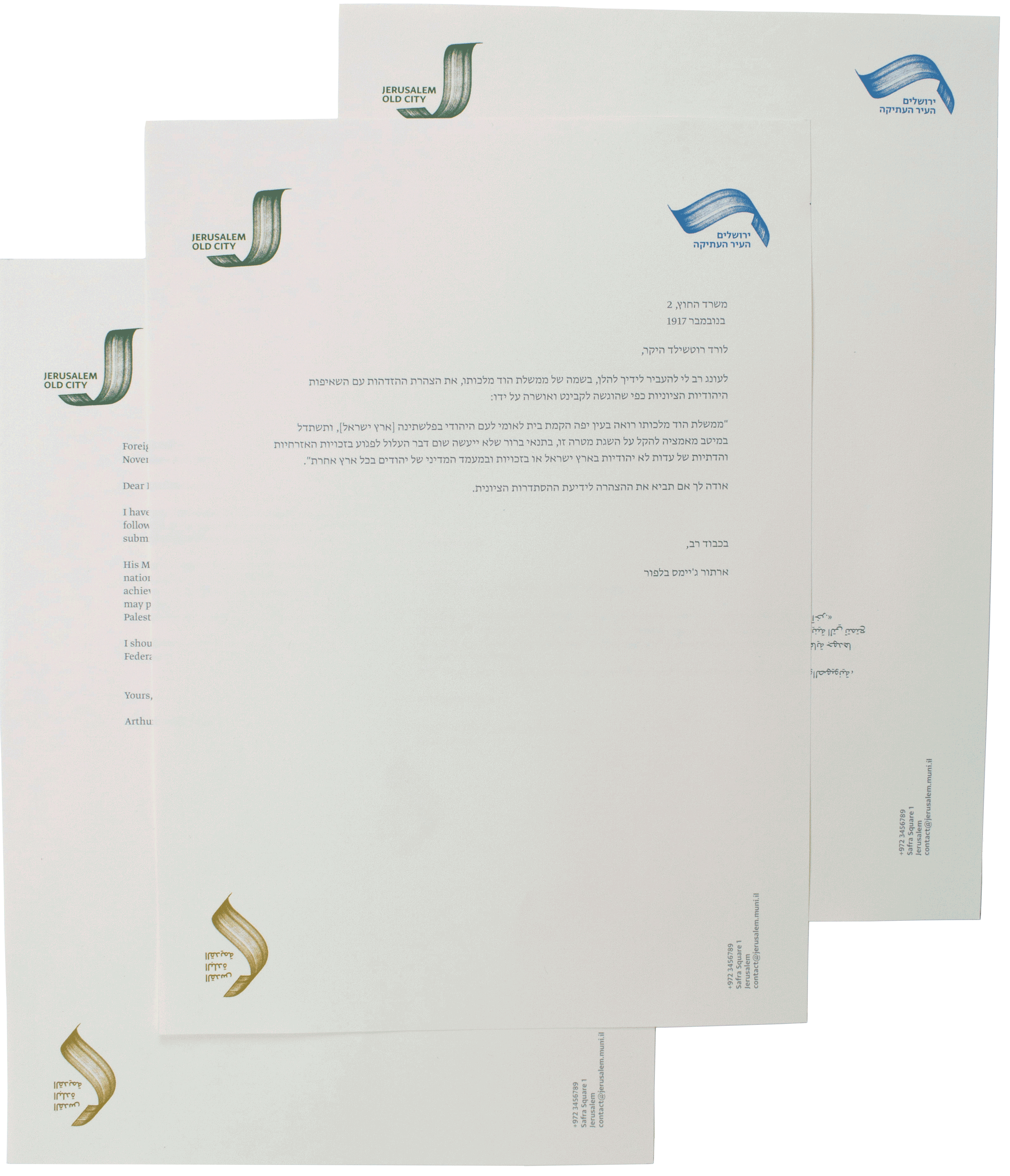
In this land, even letterheads can be real estate problems. Can the city have one letterhead that serves all its linguistic needs? Perhaps, with some re-orientation, everyone could fit. Each language is oriented along the corner that has its corresponding symbol.
But the bigger question is: Who goes where? Because both Hebrew and Arabic are both written right-to-left, only one can be alongside the English, while the other has to go on the opposite side. In our reality today, it is the Arabic-speaking side that is excluded . This small gesture and the chosen text displayed serve as subtle reminders of the current unjust reality of displacement and misrepresentation in the city today.